Evolving design for Brighton Festival
Reviewing design from past festivals, realigning with the vibe and character of the original brand, implementing change
Brighton Festival
The largest annual curated arts festival in England, celebrating everything from music, dance, literature, arts, community events and many more.
Joining just before the start of the 2019 festival, I experienced first hand the amount of effort and energy that goes into such an event.
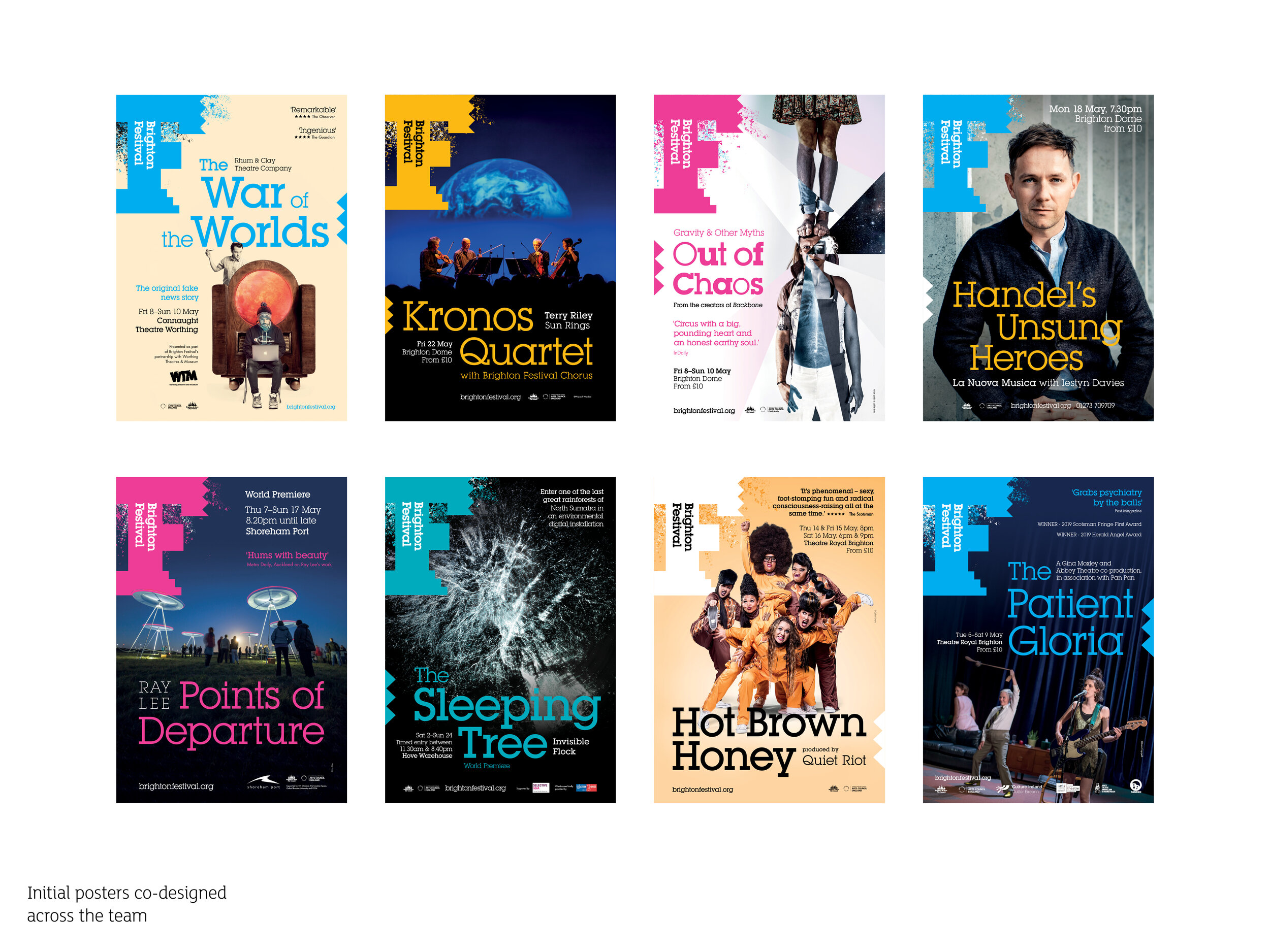
Promoting the festival as a whole, as well as individual shows, involves a huge range of design activities including posters, programmes, banners, flags, hoarding panels, social and digital assets, animated gifs and video slides to name a few. This falls on a handful of Marketers and 2 Designers.
Each year, Johnson Banks (in collaboration with Brighton Festival and the Guest Director), produce the ‘lead creative’ artwork, based on that year’s Guest Director and the theme they set.
Review
Once the 2019 festival had finished, I started to gather together all the design work ready to review. Working together alongside the other designer, we constructed and ran some workshop activities with the rest of Marketing. These focused on reviewing the 2019 festival and exploring the Brighton Festival brand.
We first read out a series of words that defined the vibe and character of Brighton Festival as intended in the original branding created by Johnson Banks in 2013.
Posting all the designs on the wall from the 2019 festival, we asked the team to pop up their thoughts and reactions – about the content, the visuals, how this made them feel, whether it enticed them to check out the festival or a specific show etc.
Next we handed out some big festival ‘F’ logos, split the team into 3 groups and asked them to write down the kinds of words, values and tone they would want to use to describe Brighton Festival going forwards.
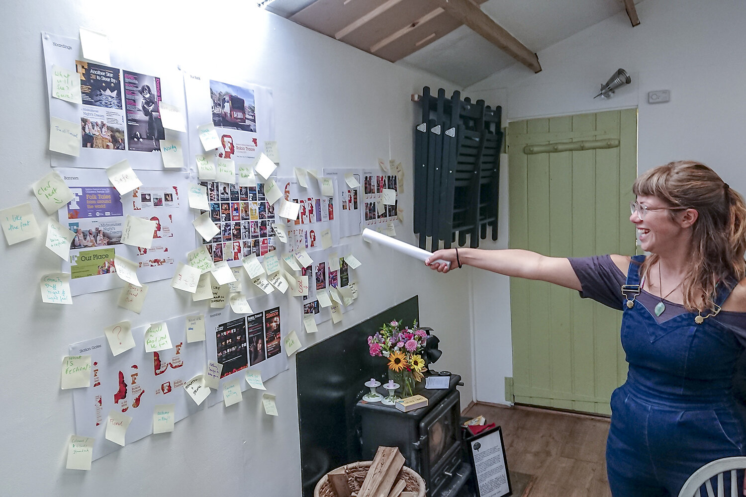
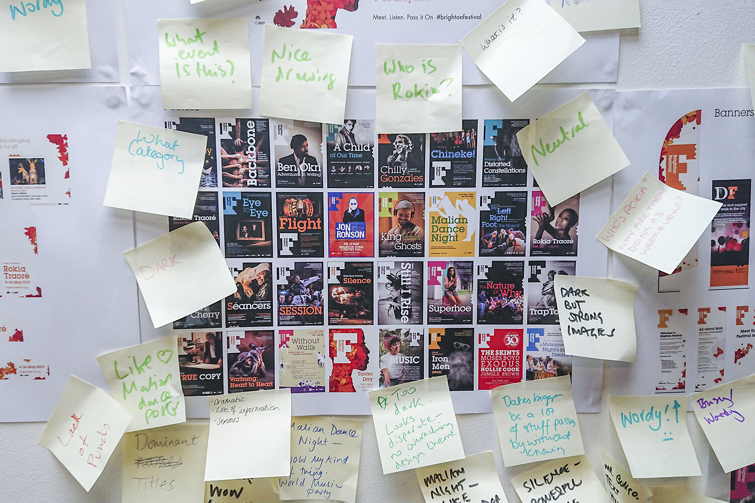
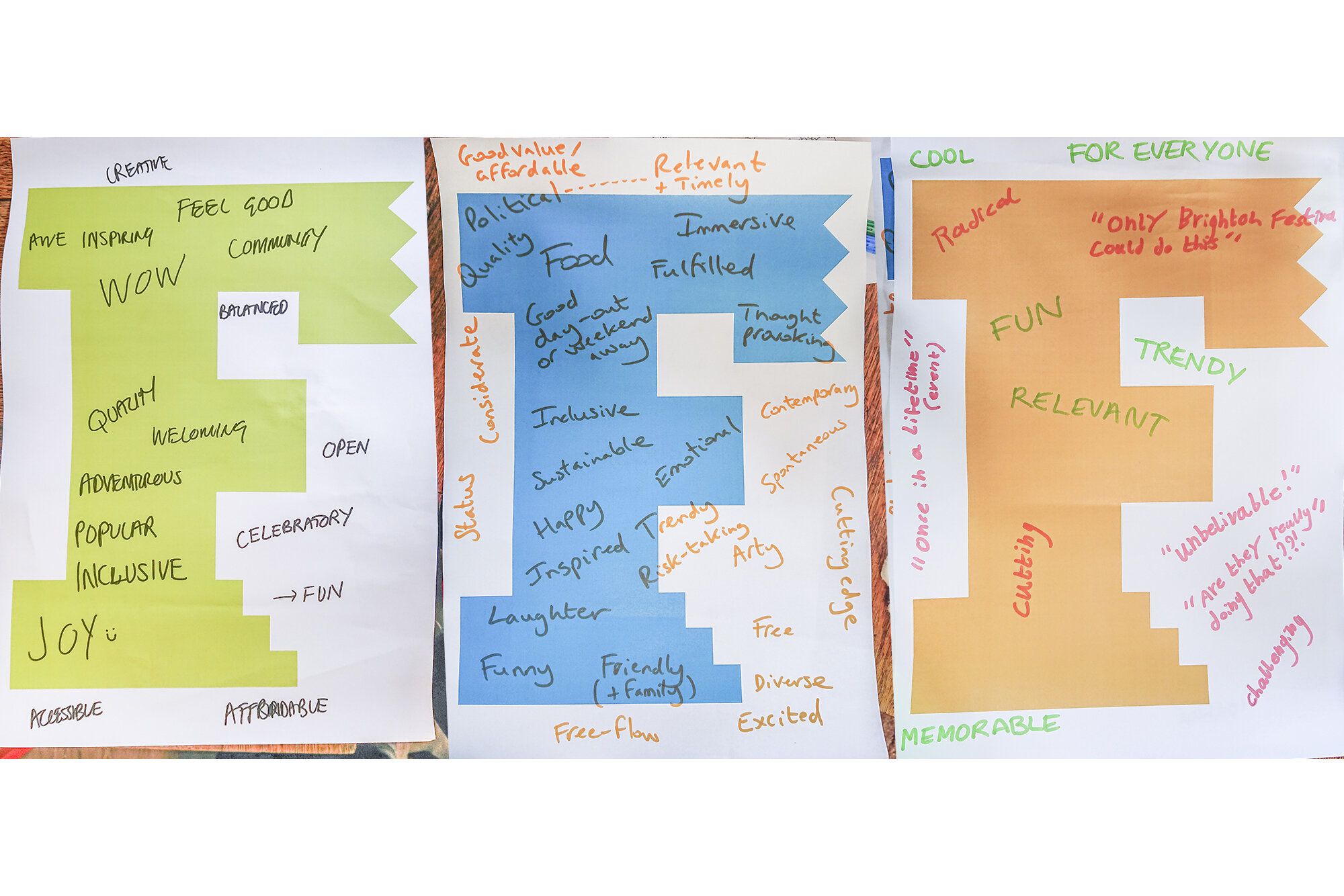
Many insights were surfaced including whether the design work across the 2019 festival matched the vibe and values of the brand.
There was also much discussion around how appealing and representative the ‘lead creative’ was, for the diverse collection of events away from the Guest Director’s main genre – and alongside this, how visible the Brighton Festival brand stands out within the lead creative, when executed across the different mediums.
Finally we discussed our responsibility to the environment, ideas about how we could be more intelligent with the amount of print we produce, as well as pushing more digital work.
Brighton Festival 2020
At the end of 2019, and along with the start of the brochure design, we revisited the insights from the summer review.
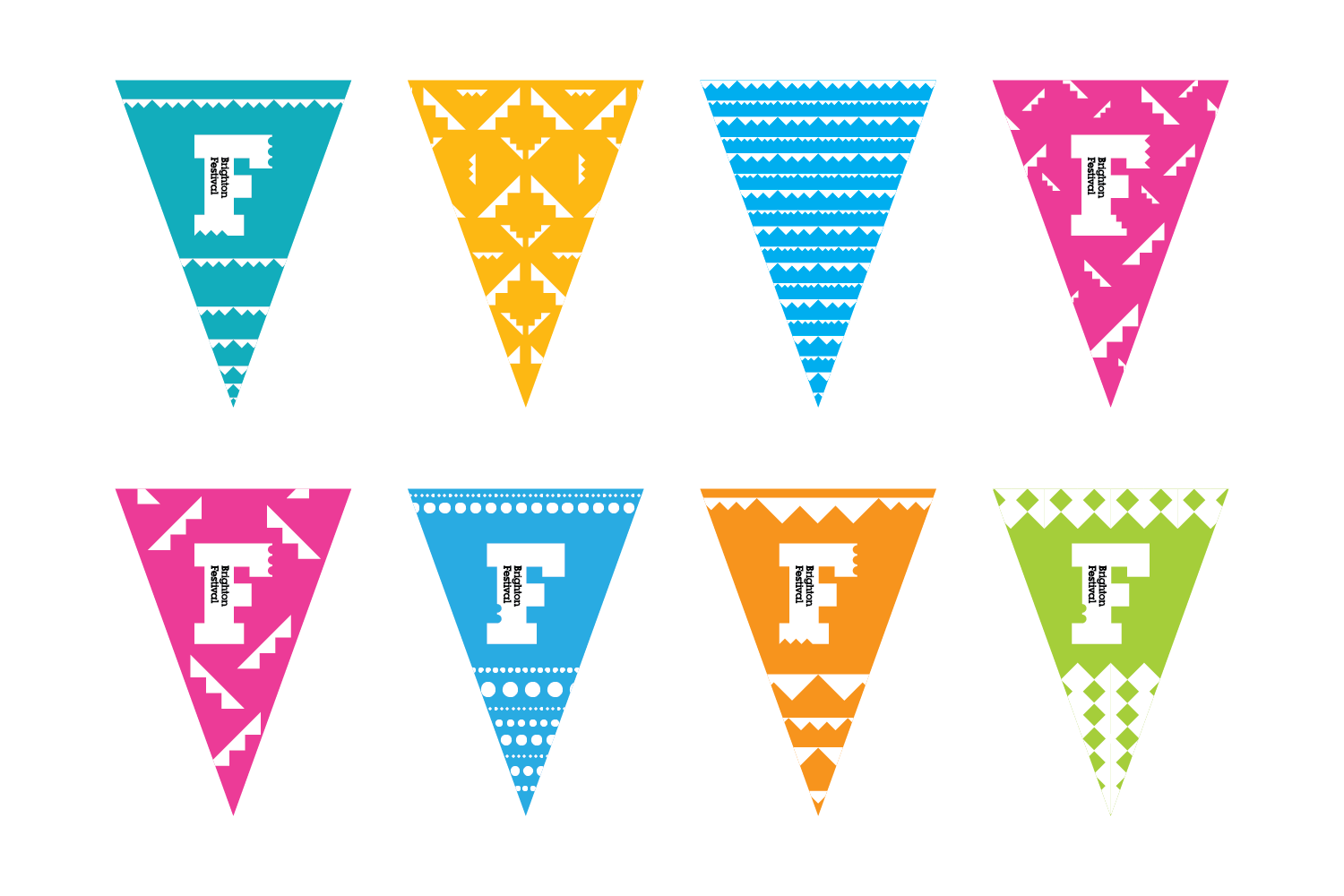
I initially began creating a universal design that utilised existing brand elements and colours. This had many benefits:
It was a design that could happily run alongside the lead creative giving greater prominence to the overall festival brand, whilst also providing consistency, especially in those times between festivals, and before a Guest Director is announced. Thirdly, and importantly, it meant we could start to reuse more items each year.
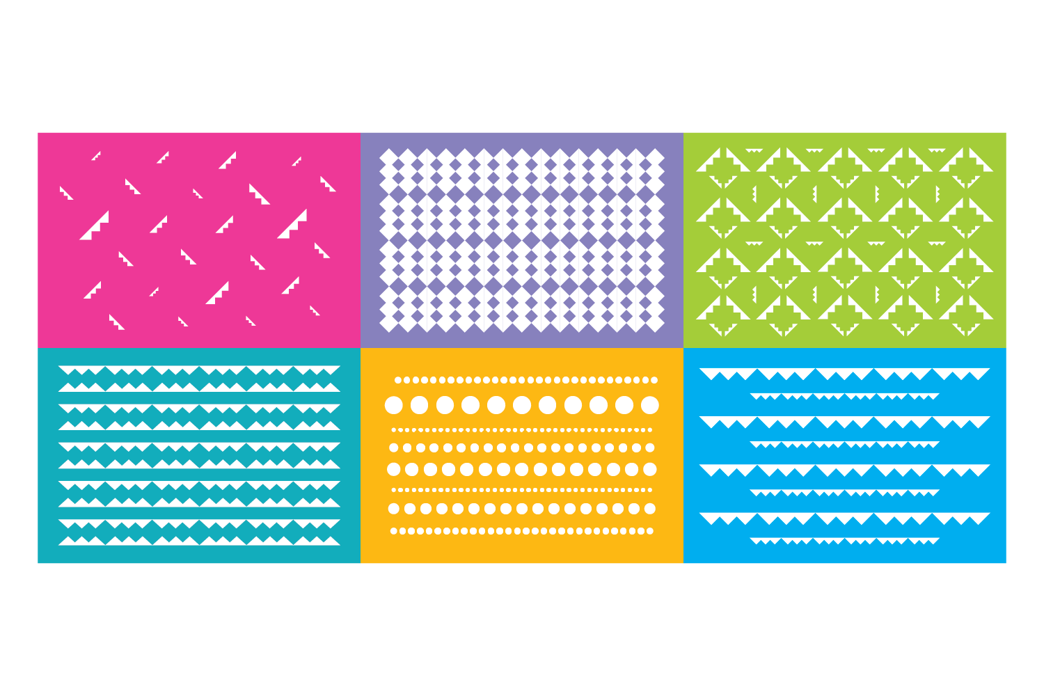
Initial universal design experimentsWe all really loved the original brand words, and these became the starting point of the ‘Brighton Festival is…’ campaign.
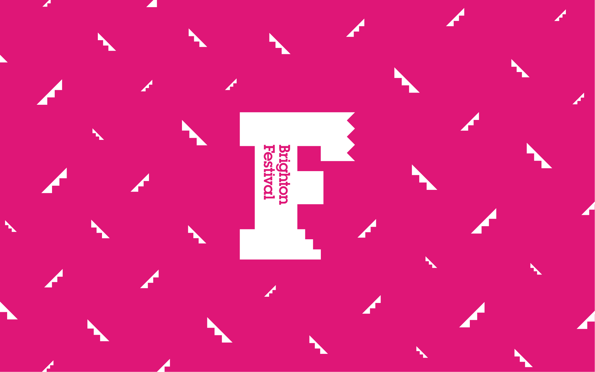
Utilising F words, created a clear, strong, and playful link back to the Brighton Festival logo – a dominating F.
Working with the Marketers I started designing a series of animations expressing specific ‘F’ words that describe Brighton Festival. These formed part of the build up to the Programme launch, and would then follow on throughout the festival.
Below: the first two Campaign animated gifs, followed by one of the Brochure Countdown gifs, and the first of the Genre Specific gifs.
Result
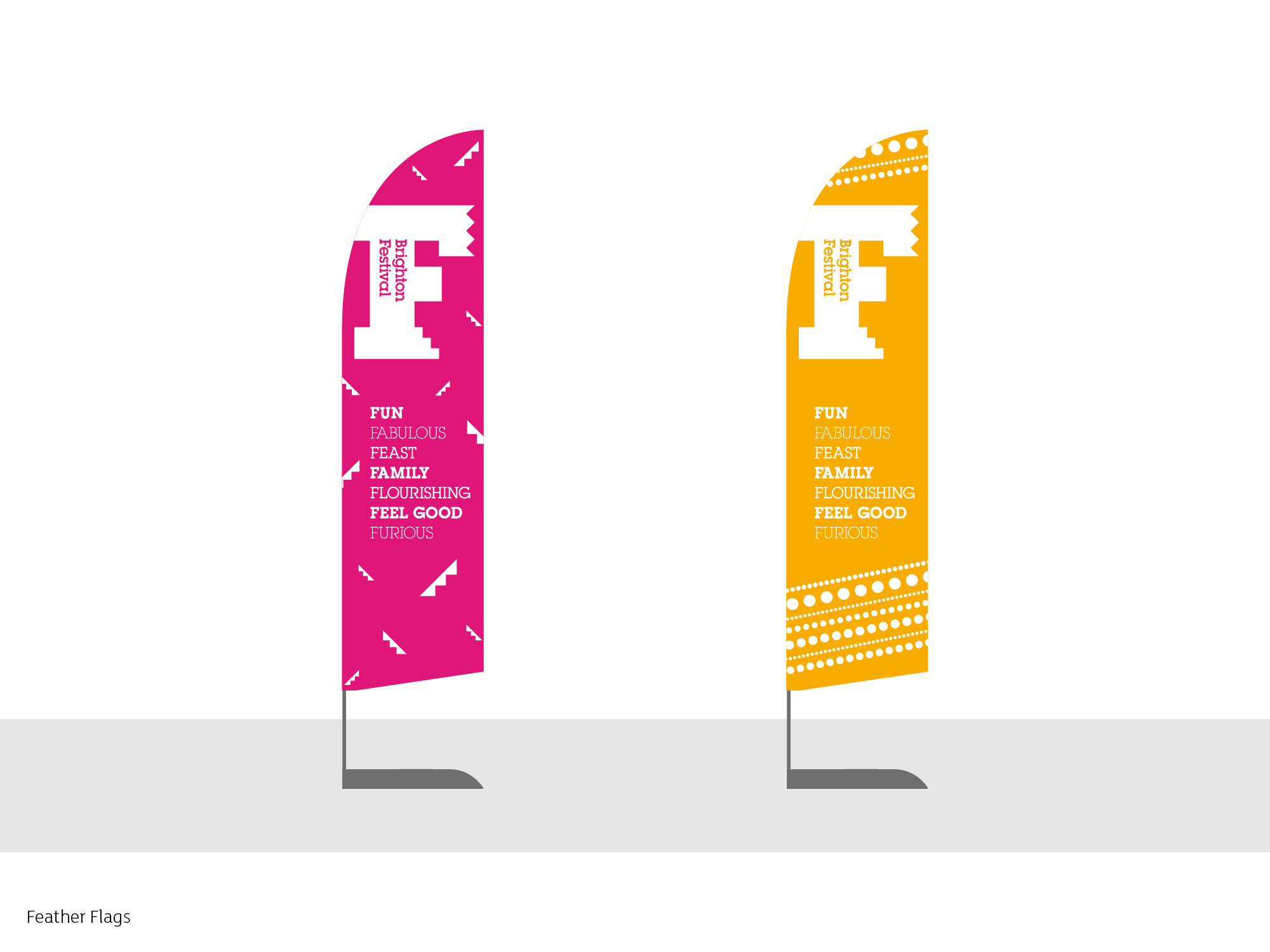
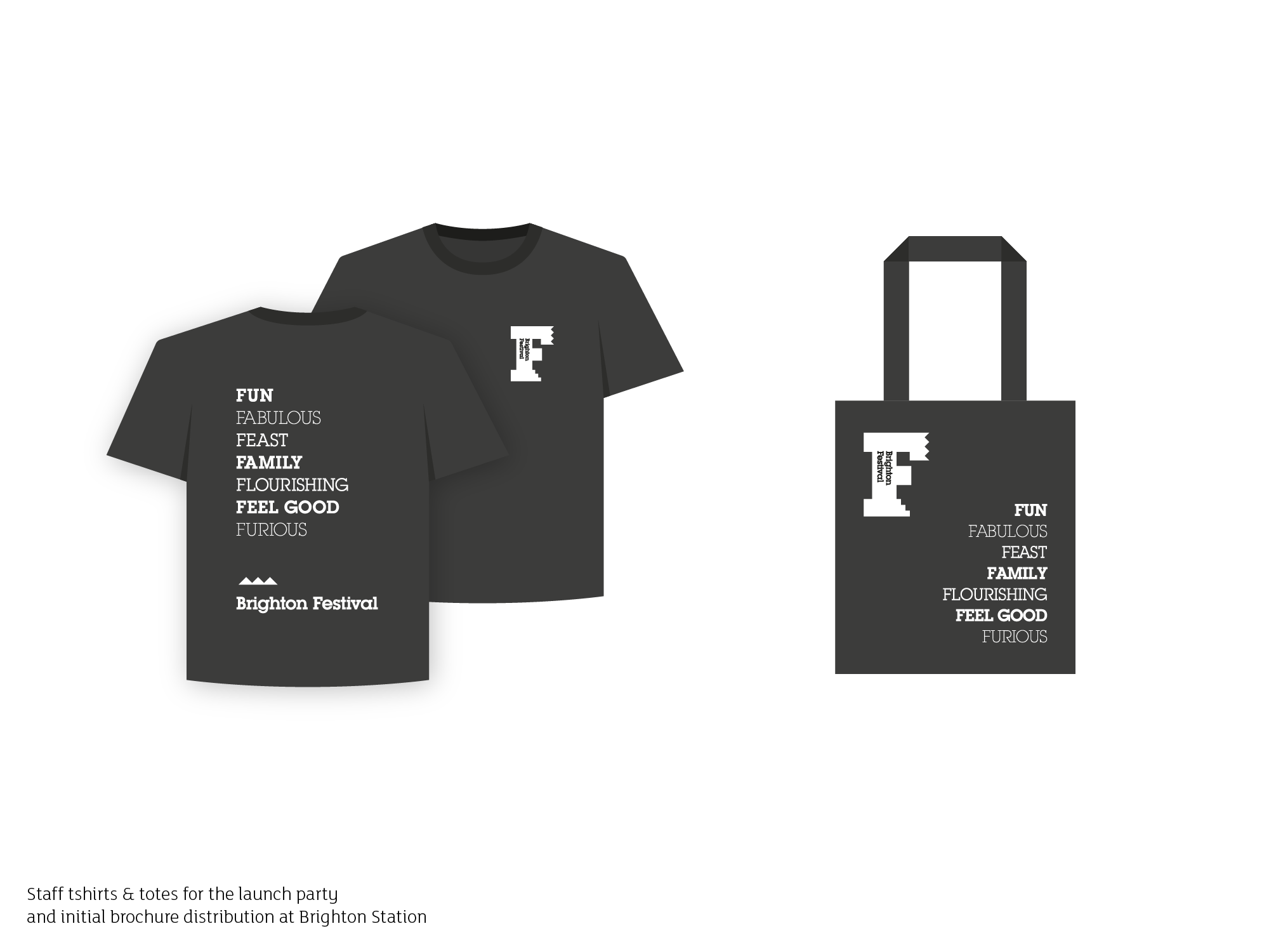
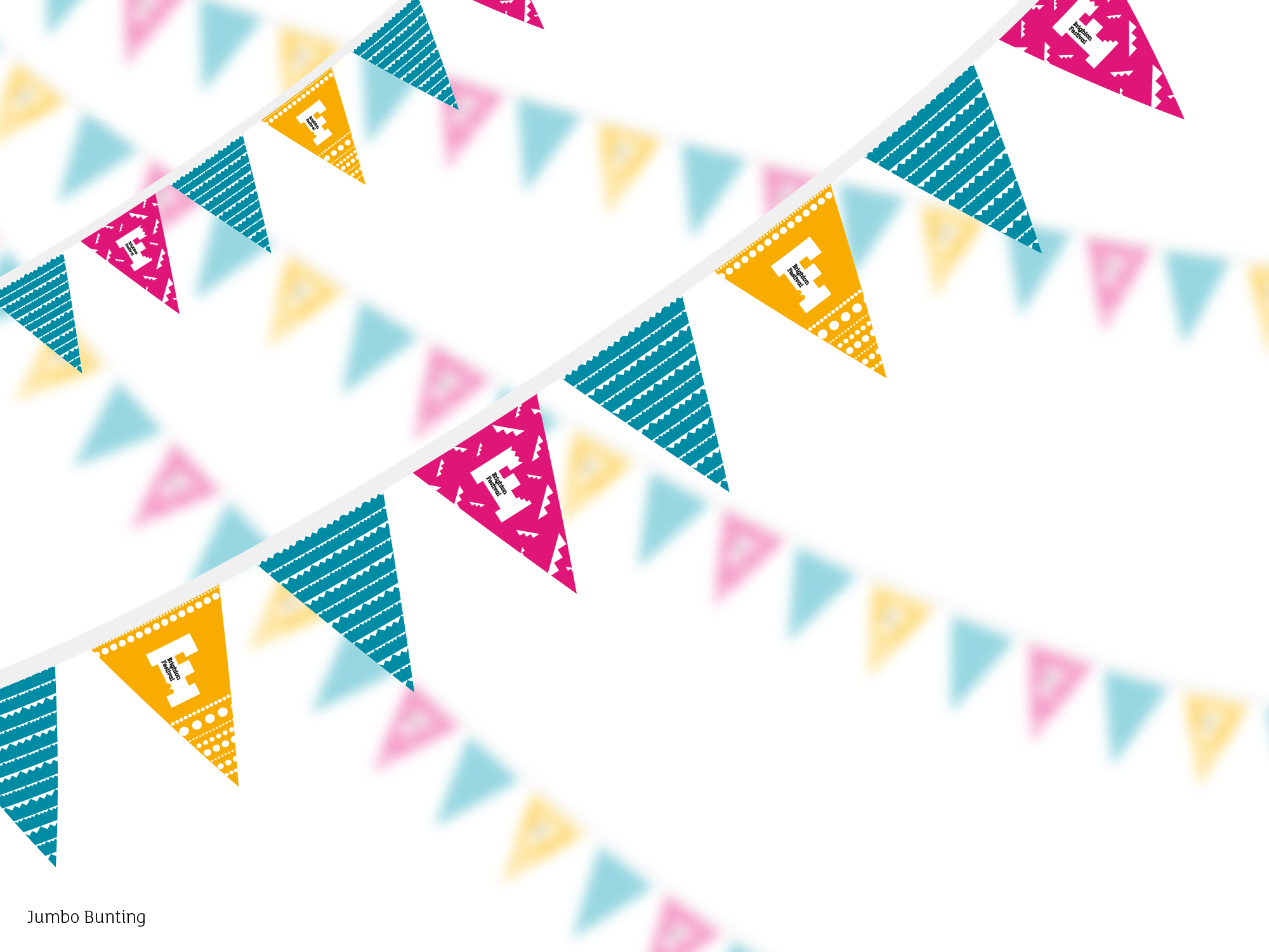
Sadly, due to covid, the 2020 festival was cancelled, which halted the project mid way through. You can see designs below for the feather flags, jumbo bunting, tshirts and tote bags, all which were produced. As they utilised this universal approach, they can be used for many years to come.
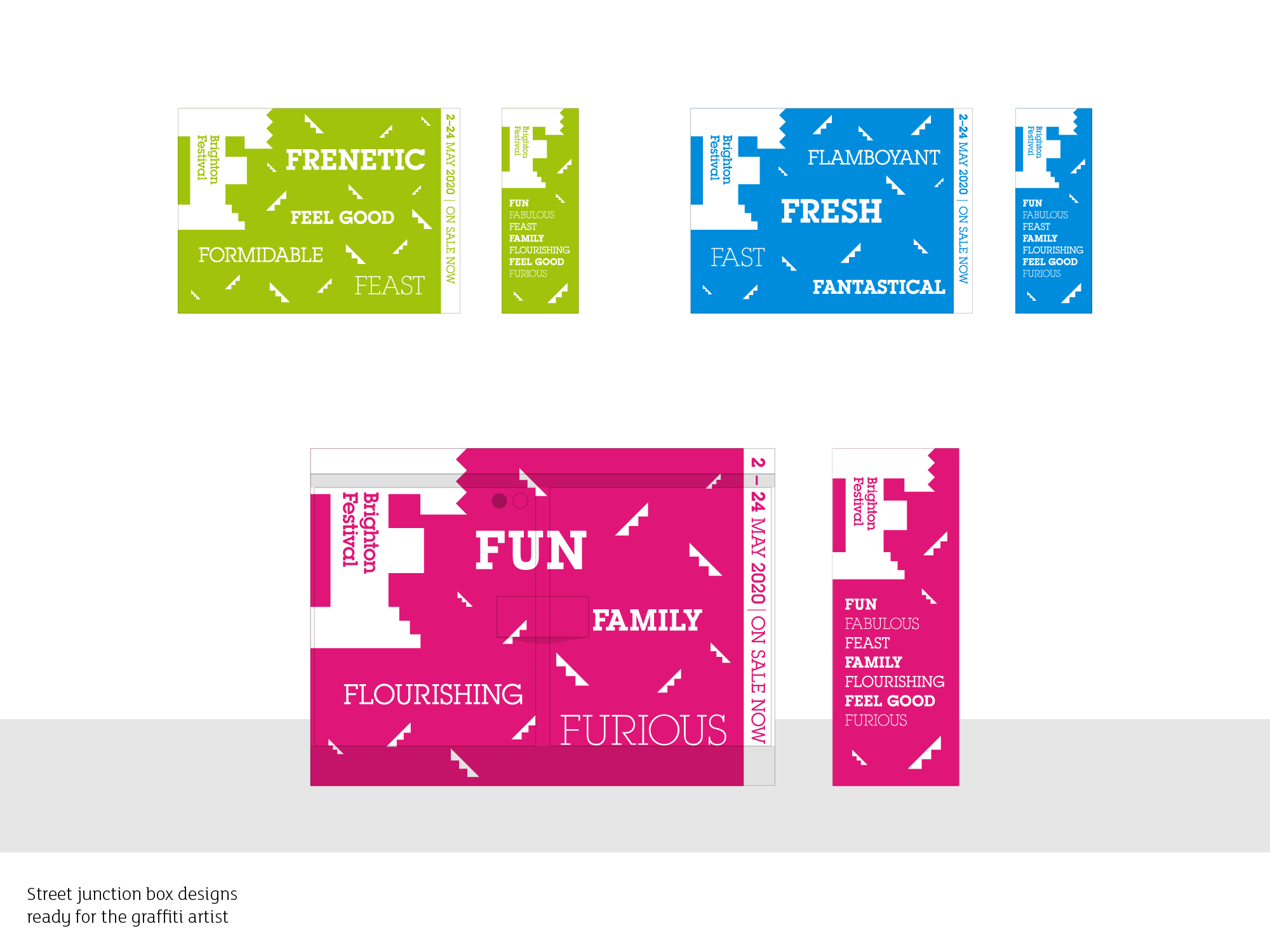
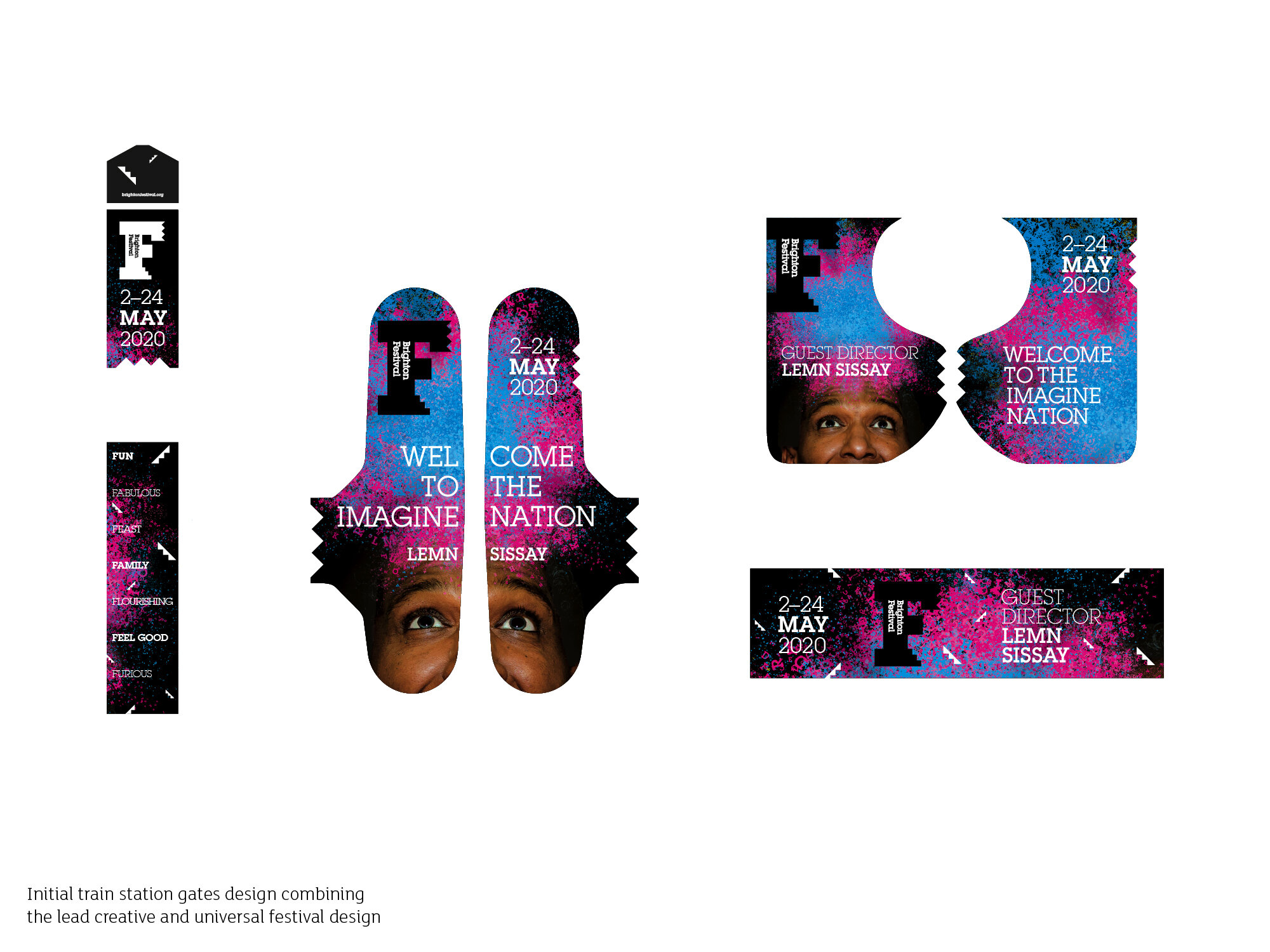
Additionally, there’s the initial set of poster designs and train station gates that started to combine elements of the universal design with the 2020 lead creative artwork.